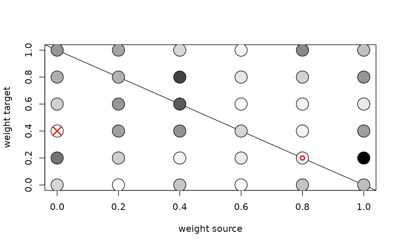
Displays values in y in a grey scale (white=lowest, black=highest),
for different combinations of the two variables in x.
The lowest value is indicated by a red cross,
and the lowest value on the diagonal is indicated by a red circle.
Examples
values <- seq(from=0,to=1,by=0.2)
x <- expand.grid(source=values,target=values)
y <- stats::rexp(n=length(values)*length(values))
plot_weight(x=x,y=y)

#> NULL